How are Sales Dollars Calculated?

Counterpoint’s Sales Reports report as NET Sales, or the amount that you collected that was not sales tax or liabilities from Gift Card Sales.
How should you use Sales Numbers?
You can use sales reporting to:
- Monitor performance of each store
- Monitor performance of each category
- See what items are contributing most to your bottom line
Reporting on Sales
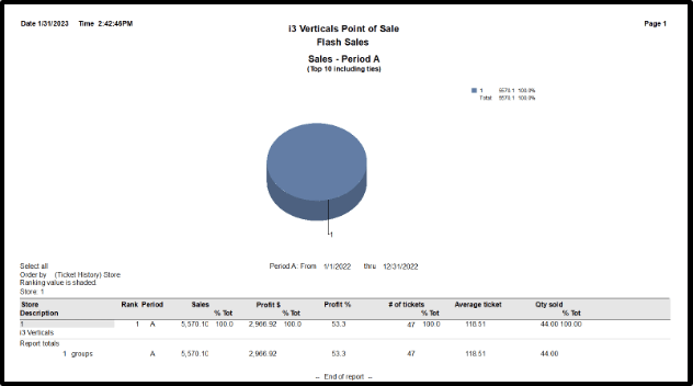
Total Sales by Store
The Flash Sales Report can be used to see the total sales numbers of each store in your environment in a clean, easy to read format. This report also allows you to pick which data points print on the report. To run the Flash Sales Report:
- Select Sales History → Reports → Flash Sales Report
- (Optional) Check box to Show pie chart

- Enter a Date Range in Report periods for Report period A
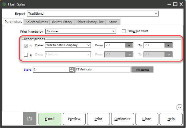
- (Optional) Check the box for Report period B and enter a date range to compare two time periods
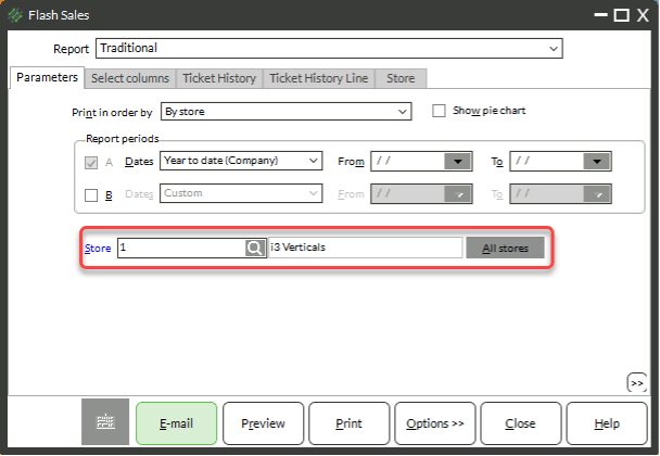
- Enter a store or click the button for All stores
-
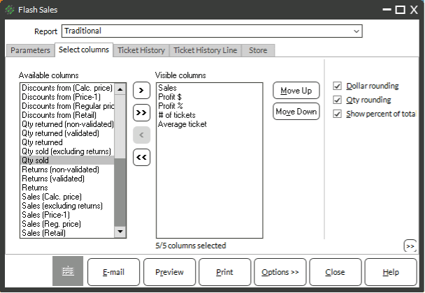
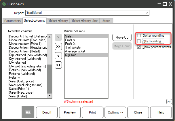
- Click the Select columns tab
- Pick and choose what data points to print on the report by moving the columns into the visible columns area by either:
- Double-clicking a column header you want to add or remove
- Clicking once and using the right or left arrow button
NOTE: Recommended data points include:
-
- Sales
- Profit $
- Profit %
- Qty sold
- # of tickets
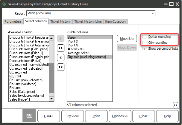
- If you have chosen more than five Visible columns/data points, use the Report drop-down at the top of the window to select one of the Wide column layouts

- Uncheck the Rounding checkboxes
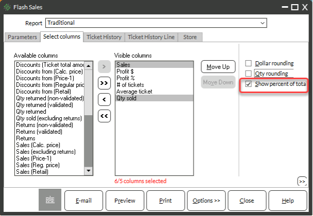
- (Optional) Check or uncheck the Show percentage of total check box
NOTE: If checked the checkbox will show the percentage of the total sales and other data points. This can clutter the report. You can preview the report to determine if you want to keep the percentages of totals or not.
- (Optional) Use the Ticket History, Ticket History Line, and Store tabs to filter the report
- Click Preview
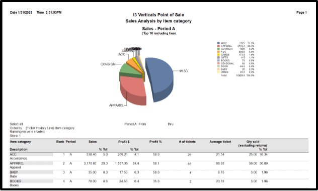
Sales by Category
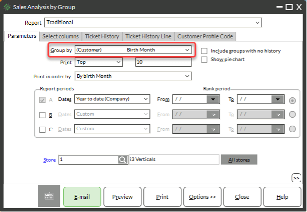
The Sales Analysis by Group Report can be run to show you a breakdown of sales by category. This report also allows you to pick which data points print on the report. To run the Sales Analysis by Group Report for categories:
- Select Sales History → Reports → Sales Analysis by Group Report
- In the Group by drop-down, select (Ticket History Line) Item Category
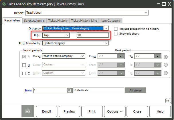
- Choose a number of records to print by either choosing:
- Top + a number of records – This will show the top number of categories based on the Print in Order by field
- Bottom + a number of records – This will show the bottom number of categories based on the Print in Order by field
- All – This will show all categories
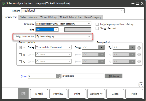
- Choose a Print in order by from the drop-down menu
NOTE: Most options in the print in order by drop-down are numeric and will print from most to least. If you need this report to print in an alphabetical order, choose either By item category (in alphabetical order by Category Code) or by group description (in alphabetical order by Category Description).
- Enter a Date Range in Report periods for Report period A

- (Optional) Check the box for Report period B and/or Report Period C and enter a date range to compare up to three time periods
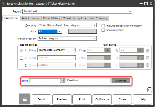
- Enter a store or click the button for All stores
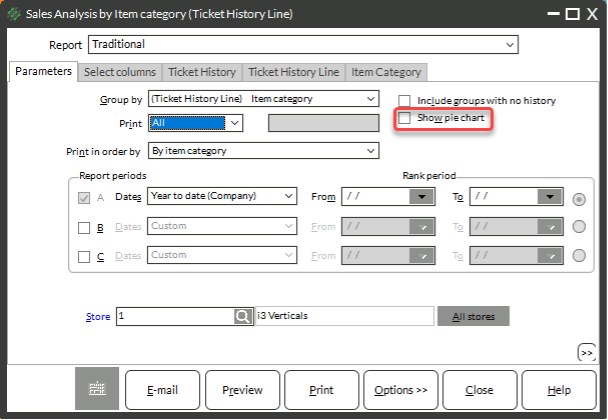
- (Optional) Check the box for Show pie chart
-
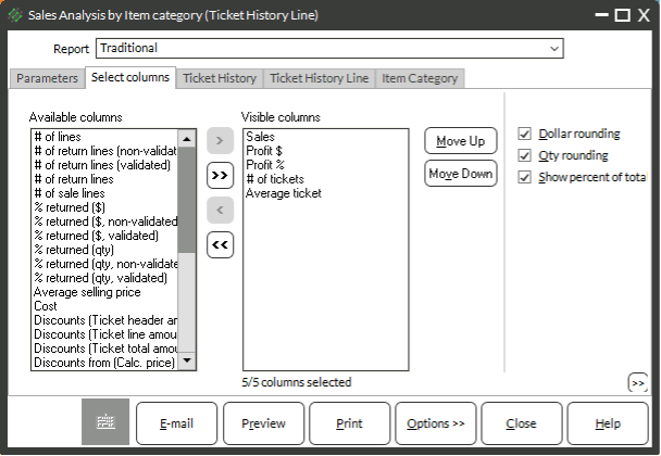
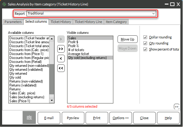
- Click the Select columns tab
- Pick and choose what data points to print on the report by moving the columns into the visible columns area by either:
- Double-clicking a column header you want to add or remove
- Clicking once and using the right or left arrow button
NOTE: Recommended data points include:
-
- Sales
- Profit $
- Profit %
- Qty sold
- # of tickets
- If you have chosen more than five Visible columns/data points, use the Report drop-down at the top of the window to select one of the Wide column layouts
- Uncheck the Rounding checkboxes
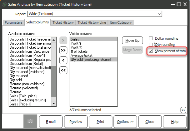
- (Optional) Check or uncheck the Show percentage of total check box
NOTE: If checked the checkbox will show the percentage of the total sales and other data points. This can clutter the report. You can preview the report to determine if you want to keep the percentages of totals or not.
- (Optional) Use the Ticket History, Ticket History Line, and Item Category tabs to filter the report
- Click Preview
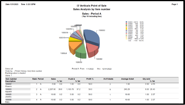
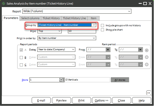
Sales by Item
The Sales Analysis by Group Report can be run to show you a breakdown of sales by item number. This report also allows you to pick which data points print on the report. To run the Sales Analysis by Group Report for items:
- Select Sales History → Reports → Sales Analysis by Group Report
- In the Group by drop-down, select (Ticket History Line) Item Number
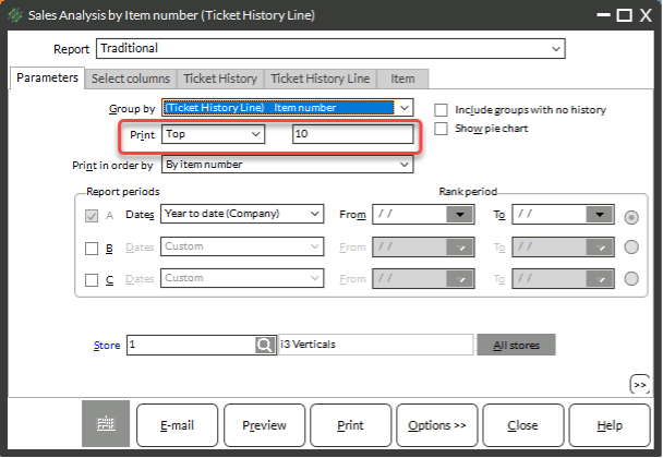
- Choose a number of records to print by either choosing:
- Top + a number of records – This will show the top number of categories based on the Print in Order by field
- Bottom + a number of records – This will show the bottom number of categories based on the Print in Order by field
- All – This will show all categories
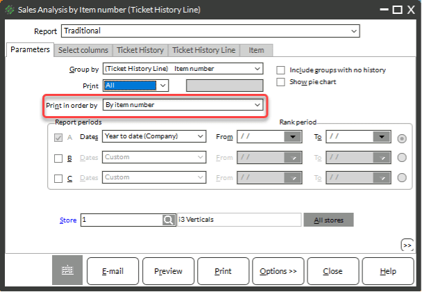
- Choose a Print in order by from the drop-down menu
NOTE: Most options in the print in order by drop-down are numeric and will print from most to least. If you need this report to print in an alphabetical order, choose either By item category (in alphabetical order by Category Code) or by group description (in alphabetical order by Category Description).
- Enter a Date Range in Report periods for Report period A
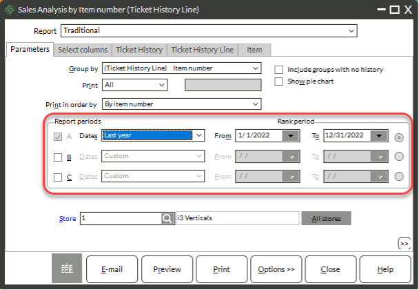
- (Optional) Check the box for Report period B and/or Report Period C and enter a date range to compare up to three time periods
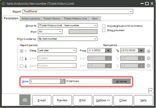
- Enter a store or click the button for All stores
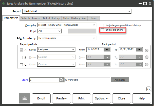
- (Optional) Check box for Show pie chart
-
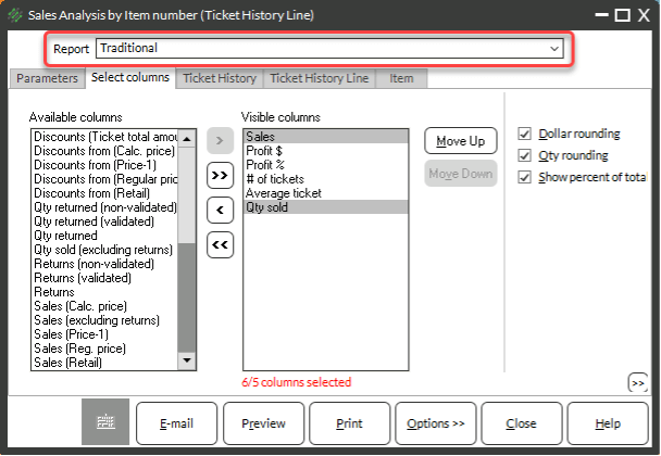
- Click the Select columns tab
- Pick and choose what data points to print on the report by moving the columns into the visible columns area by either:
- Double-clicking a column header you want to add or remove
- Clicking once and using the right or left arrow button
NOTE: Recommended data points include:
-
- Sales
- Profit $
- Profit %
- Qty sold
- # of tickets
- Discounts (Ticket total amount)

- If you have chosen more than five Visible columns/data points, use the Report drop-down at the top of the window to select one of the Wide column layouts
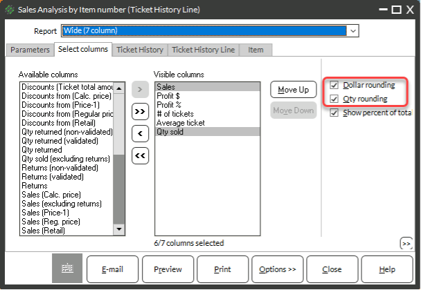
- Uncheck the Rounding checkboxes
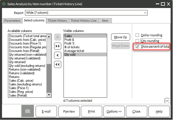
- (Optional) Check or uncheck the Show percentage of total check box
NOTE: If checked the checkbox will show the percentage of the total sales and other data points. This can clutter the report. You can preview the report to determine if you want to keep the percentages of totals or not.
- (Optional) Use the Ticket History, Ticket History Line, and Item tabs to filter the report
- Click Preview